Google is planning a significant redesign of how Android users access notifications and quick settings, according to a leaked build of Android 17 that surfaced this week. The change would allow users to choose between keeping the traditional combined panel or switching to a new split interface where notifications and quick settings appear on opposite sides of the screen.
The leak came from internal development builds shared on Telegram by Mystic Leaks, showing what appears to be an early version of Android 17. The design represents a maturation of concepts that have been rumored for over a year, as Google has gradually tested this feature across different Android releases.
Background
Google has been working on this split panel concept for quite some time. The company first began testing separate notifications and quick settings panels in Android 16, though the feature was not enabled by default in early beta releases. The change marks a shift away from the unified notification shade that Android has used for years, where both notifications and quick settings controls appeared in the same panel.
This redesign effort comes as Google looks to modernize Android's user interface. The company has been gradually rolling out Material 3 design changes across the operating system, and the notification panel overhaul fits into this broader visual refresh. Several Android manufacturers, including OnePlus and Xiaomi, already offer split panels as an option in their custom Android skins, so Google is essentially bringing this popular feature to the base Android experience.
"Separate: Swipe down from the top right to open Quick Settings. Swipe down from the top left to open notifications."
The approach Google is taking differs from what some manufacturers have done. Rather than forcing all users into the new design immediately, the company is planning to make it optional, letting people choose what works best for them.
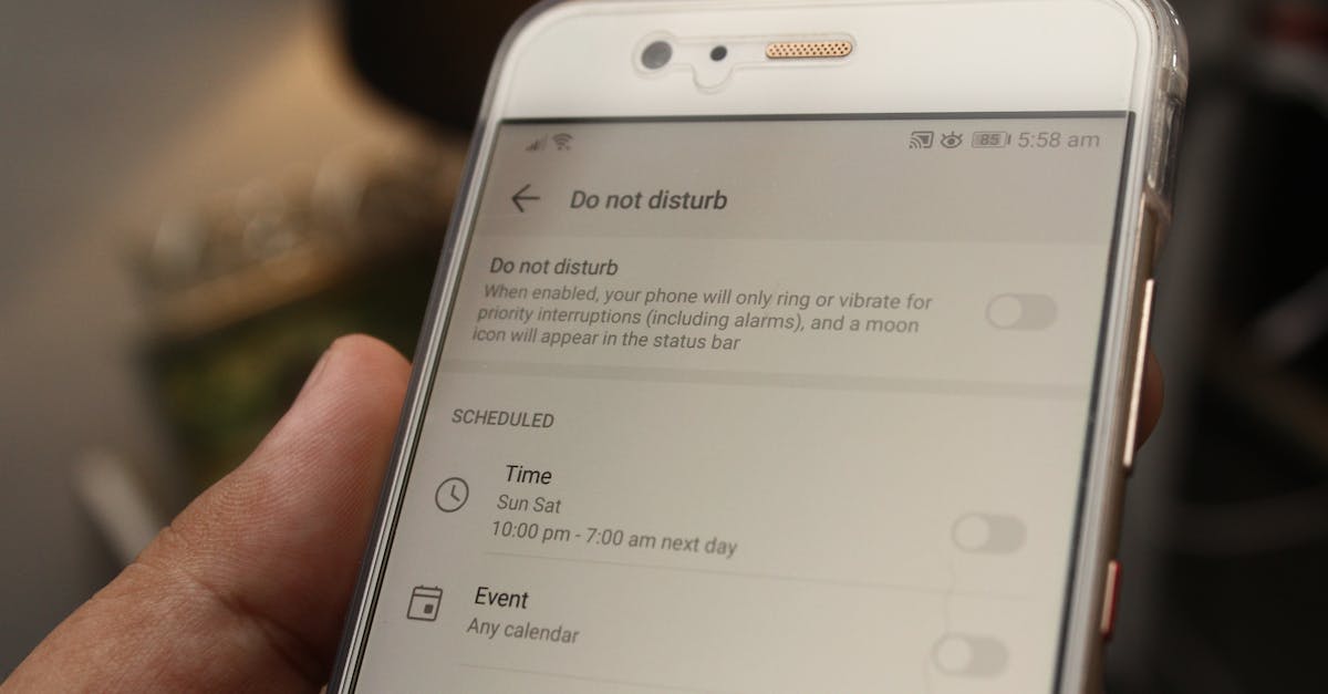
Key Details
The leaked build shows two distinct options users would have in Settings under Notifications & Quick Settings:
The first option, called "Separate," would split the interface into two separate panels. Swiping down from the top left of the screen would open the notifications panel, while swiping from the top right would bring up quick settings. The notifications panel would display a large clock at the top, with the date, day, and status bar icons arranged in pill-shaped containers at the corners. This design keeps the notifications list unchanged from the current version, maintaining familiarity for users.
The quick settings panel accessed from the right side would appear as a sheet that slides down from the top of the screen. It would include a miniature clock, carrier information, and options to edit quick settings or access the full settings menu. A notable addition in this build is a volume slider positioned directly underneath the brightness control. Users could tap a three-dot button next to the sliders to access the complete set of volume controls if needed.
The second option, called "Combined (classic)," would preserve the traditional interface that Android users know today. This option would allow users to swipe down from anywhere on the screen to access both notifications and quick settings in one unified panel.
Changes to Quick Settings tiles
The leak also reveals that Google plans to bring back a dedicated "Mobile Data" quick settings tile, something that has been missing since Android 12. This tile would use a cellular bar icon to represent mobile data, separate from the Wi-Fi toggle. The company appears to be reversing a controversial decision made years ago to combine Wi-Fi and mobile data into a single expandable Internet tile.
On large screens, such as foldable devices, Google plans to make the separate panel design the only available option. The combined view would be limited exclusively to the outer screen of foldable phones, according to the leaked build.
What This Means
This change represents Google listening to feedback from users and developers who found the combined Internet tile less convenient than having separate toggles. Power users in particular have complained about the extra steps required to toggle Wi-Fi or mobile data since Android 12 introduced the unified Internet tile.
The optional nature of the split panel design suggests Google wants to balance innovation with user preference. Not everyone wants a major interface change, so offering both options means existing Android users won't feel forced to adapt to something unfamiliar. Those who prefer the new split design can enable it, while others can continue using what they know.
The timing of this leak comes as Google prepares for its typical Android release cycle. Android 17 is expected to arrive sometime in the coming months, though the company has not announced an official release date. The feature may also appear in Android 16 quarterly platform releases before making its way to Android 17, following Google's recent pattern of testing major changes across multiple release cycles before rolling them out widely.
These changes indicate Google is continuing to refine Android's core interface based on what works well in competing platforms and what users actually want. The split notification and settings design has proven popular on other devices, and bringing it to stock Android gives the company a chance to improve the experience for hundreds of millions of users worldwide.